

- We’re a visual species. Images engage our attention like nothing else. And they keep us reading. Producers keep forgetting this.
- Images signify quality. Google uses them as a ranking factor, and readers use them to assess the care taken in producing content.
- Compelling visuals require clarity of thought. They help you write sharper text.
- Stock photos are over-used: readers crave something more distinctive and useful.
- Visuals are becoming easier to create. Anyone can make simple quote and stats cards, charts that tell their own stories, and even short videos.
1. We’re a Visual Species
Think about how you navigate digital media. You likely do the following things:
- Scan social streams and blog posts before you read anything in depth.
- Abandon articles if they look like they’re wordy and hard work.
- Spend as much time watching videos as reading.
The drivers of these behaviours are fundamental: our brains have evolved to make quick life-and-death decisions based on what we see, and they’ve been fine-tuned to avoid time-wasting. Half the human brain is involved in visual processing, and it takes us a tenth of a second to assess a face for attractiveness and trustworthiness.
Now, think about the decisions you make when you are producing written content. You likely do the following things:
- Write first and think about visuals later.
- Use a lot of stock photos.
- Don’t touch video – it’s too complicated.
There’s a big difference between how we behave as consumers of digital content and what we do when we produce it. Nowhere is this more so than in decisions we make over images in our web posts and social media.
This is what the data says:
- Facebook tells advertisers that users only give them 2.5 seconds before they move on to the next social post in their feeds. On mobile, it is just 1.7 seconds.
- A 2010 University of Missouri study of responses to homepage designs suggested it takes less than 0.2 seconds for someone to assess a website.
- Videos on social networks generate 1200% more engagement than image or text posts.
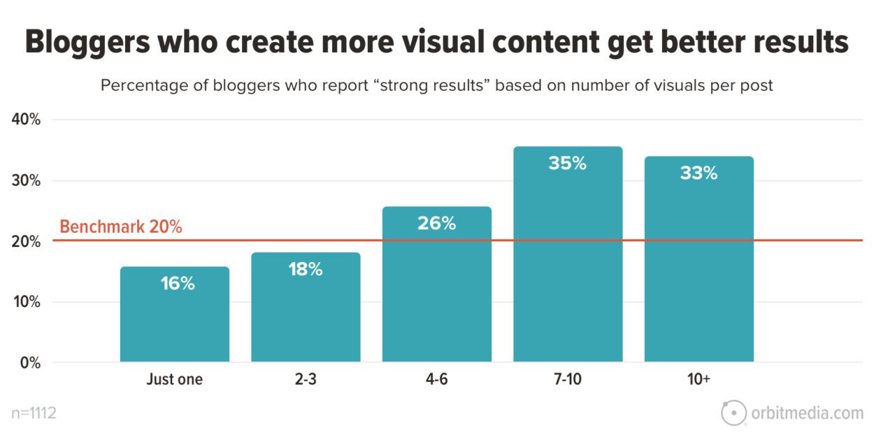
- According to Orbit Media’s annual survey, bloggers who create more visual content get the best results.

Why do we have a blind spot when it comes to visual content?
The simplest explanation is that we behave differently in formal situations:
- Communications tend to be written, meaning text becomes dominant, and visuals an afterthought.
- There’s an assumption that visual content is more complicated to produce than text (true).
- Notions of what is ‘professional’ lead to the view that specialist designers are required (which is no longer always valid).
The combination of these factors means that most digital producers underplay visual content, which is a shame as it contradicts our lived experience.
Further reading: This is Why Your Content isn’t Cutting Through–Scanning
2. A Signal of Quality
Google’s business model demands that it give users high-quality and relevant answers to their questions. The Google algorithm uses intelligence from billions of searches that show what content generates real engagement. One of the most important indicators is the presence of images, including video.
The algorithm tracks behavioural patterns. It finds that posts with images are stickier than those without. And it’s not hard to understand why this should be:
- Images create structure and make it easier to scan. This is particularly true on mobile, where all the data shows users are more impatient.
- Richly illustrated posts signify care has been taken. Most people don’t want to waste time on poorly produced, hard-to-understand content, and using illustrations signals steps have been taken to make material accessible.
- Combining text and images aids comprehension. Estimates suggest that up to 80% of us are ‘visual learners’, meaning we absorb information best when images and text reinforce one another.

The net result is that posts with multiple images perform much better:
- Buzzsumo found that articles with an image every 75-100 words got double the number of shares of articles with fewer images.
- Orbit Media’s annual survey of bloggers shows those using 7+ images per post get the best results.
3. The Clear-headedness You Need for Compelling Visuals Improves Your Writing
There’s nothing new under the sun. My favourite story about the power of images comes from the Victorian age when Florence Nightingale used an infographic to argue for better sanitation for British soldiers during the Crimean War.
Nightingale’s report on sanitation was more than 800 pages long. Her illustrations aimed to ensure that no one doubted her central finding—that preventable diseases were causing more deaths than combat.

Credit: Mortality of the British army at home and abroad, and during the Russian war, as compared with the mortality of the civil population in England. Wellcome Collection. Source: Wellcome Collection.
This is How Illustrations Can Improve Your Writing
To create engaging visuals, you must simplify your thinking so that your output makes sense at first glance. Users crave visual content but don’t like being made to feel stupid if they find it confusing.
Devising a simple illustration belongs to that family of tactics that shift your brain into being more natural, audience-focused, and clear-headed in its storytelling. The family includes:
- Recording yourself talking about your topic before you write anything.
- Asking a friend to interview you.
- Reading your stories out loud to check they flow.
I’ve found that three powerful things happen once I start thinking visually:
Simple storytelling: You have to zero in on the key ideas. Is your article as straightforward?
Visual metaphors are a mainstay of effective illustrations and will liven up your text.
War on wordiness: space limitations mean text on images requires the creativity of headlines.
- Core focus: Compelling images can only convey a few ideas. So you need to ensure they’re the most important. This is a valuable check on whether you have given those ideas sufficient weight in your text. It also encourages you to question whether the remaining points are worth covering.
- Visual metaphors are essential and lead to livelier language. In this piece, I’ve used the blink of an eye to illustrate the time it takes to make decisions on social media.
- Making every word count. Space limitations mean that writing text to be used on images becomes like writing headlines – it forces you to think creatively and express yourself succinctly. All your text should be like this.
Visuals for promotion
I start with brief bullet points covering the ground and flow logically. I’ve seen this likened to telling your story in tweets. Getting this right can take a while, but it makes writing much easier. This piece had a working headline of ‘7 Reasons You Should Be Using More Visuals in Your Content’, but after refining the bullet points, it became nine.
Then, I consider how to promote the piece on social media, which generally involves an infographic, carousel, or short video. Devising the outline for these things—the very few words that drive the narrative—forces me to ask, again, ‘What’s the simplest way of expressing this?’
Initially, I thought the points would make a good infographic. But you need plenty of metrics for that to work, and this is more of a practical post. It could be an instructional video, and I might do that later, but the most straightforward approach, driven by the bullet points, would be to turn it into a carousel and/or a thread.
Storyboarding — the time-honoured technique of telling a compelling visual story
If it’s the case that most readers and viewers are ‘visual learners’, i.e. that they find a combination of text and imagery easiest to consume, then it’s important to think clearly about how you will synchronise the two elements.
Note that this is how all social media works – text plus visuals.
You can write first and then retrofit imagery. Or you can illustrate as you go, section by section. But I’ve found the best way to make the interplay work is to storyboard the article right at the start.
Doing this is a useful check on whether you’ve got your structure right. If you can’t think of a visual complement to your text, it signals that it’s not interesting enough. And you may find, as I did, that some of your points are duplicative: I started with ten sections and ended up with 5.

How many images should you use in a post?
Based on the analysis in the previous section, this post contains at least one illustration for each of my points. The images fall into one of several categories:
- Highlights turn pertinent quotes and statistics into something eye-catching. In the case of quote cards, putting a face to the name increases the impact of the chosen text. In the case of statistics cards, some numbers just beg to be highlighted.
- Summary graphics reinforce the main points and ease the reader’s cognitive load. This is especially true of longer posts like this one. Compiling these focuses the mind on the key points of your text and often leads to a rewrite.
- Charts & tables can tell stories that words struggle to match. One of the most important things to do is check whether there is a simple graphical device you can use to bring your ideas alive.
4. Readers Screen Out Stock Photos
Most organisations produce brochures with nicely produced photographs of smiling people in attractive surroundings. This glossy look has migrated to official websites. And when organisations produce blog posts, they mimic the aesthetic using stock photographs.
Content producers have a strong inclination to produce ‘professional-looking’ articles. It’s the safest option and won’t get you into trouble with your boss. But this can be a trap and leave you with bland presentation and weak engagement.
Leading research firm Norman-Nielsen uses eye-tracking studies to identify best practices in web design. Nielsen finds that the most important thing when using images within posts is ‘informational value’ – its relevance to the accompanying text. Images should help users understand and absorb your text. Many producers use stock photos as decoration; users want relevance.
This explains why analysts like Venngage find stock photos the least effective visual type and that Nielsen’s #2 recommendation for memorable visuals is to ‘avoid stock photos’, which, by definition, are likely to be only loosely related to the text.

Source: Venngage
NB, I’m not suggesting you don’t use stock photos; just do so discerningly. The key idea is to ensure they are relevant to your text and have informational value.
5. Making Compelling Images is Getting Easier
On the demand side, more images are needed. On the supply side, producing effective images has never been easier.
3 Common Blindspots
There is a tendency within organisations to make three assumptions about illustrating online articles:
- If you want to look professional, you need to employ specialist designers.
- Creating visual assets is time-consuming.
- Writers should write, graphic designers should design graphics.
There will always be a demand for professional designers with the experience and aesthetic sense to bring ideas to life. However, most of what is required within social media and online articles is so straightforward it would be a waste of time for a pro.
The Minimum Viable Graphic
I created most of the illustrations in this post using cheap, easy-to-learn software. They aren’t fancy, but they do the job.
- Quote and Statistics cards: Once I’d set up a template in Canva, my two statistics cards took very little time to produce. I don’t have any quote cards in this piece, but in a previous post, I used photos, which took a little more time.
- Charts and tables: The graphic on the poor performance of stock photos was built in Google Sheets (Microsoft Excel would have been just as effective). The data came from Venngage, and once the template was set up, creating the bar chart took very little time.
- Highlights cards: I produced these using Canva and an inexpensive Wacom drawing tablet. I like the sketchy look because it is flexible and distinctive, and a lighter-hearted look and feel are part of my business’s identity. However, you can get very good results using the online tools in Canva or other image production software.
- LinkedIn Carousel: I produced this in Google Slides using images compiled in Canva.
- Social Video: I took my outline from the top of this post and gave it to Pictory AI software to create a basic social video.
You might think, “That’s fine for a one-man band consultant; we’re a grown-up organisation with standards and a reputation to uphold, and we need to look professional.”
But look around, and you’ll see the forces I’ve described above driving more publishers to equip their writers and producers with simple tools and templates to create their visuals.
You Don’t Need to Produce Everything Yourself
Producers rightly consider creating visual assets time-consuming. However, there is a much easier way of increasing the visual interest of your work: reusing imagery from other creators.
Embedding videos is the simplest way of enriching your visual content. I’ve embedded one of my YouTube videos in this article, but I could have chosen from millions of others.. Social video platforms are notable in permitting users to reuse videos. Creators can block this permission, but most use the default sharing option and benefit from broader distribution. The same goes for the Vimeo platform.
It’s the simplest, most effective way of including video in your content. Still, it’s underexploited by content producers who are strongly biased towards producing everything under their name or brand.
How to navigate the legal restrictions on reusing static images
Unlike YouTube, generic social platforms do not grant permission to reuse videos or static images. This needs to be more widely understood.
Copytrack, a business that tracks violations on behalf of copyright holders, estimates that of the 3 billion images shared daily, 85% violate copyright rules.

I’ve embedded one graphic in this post – Florence Nightingale’s 1858 bar chart highlighting the difference in mortality from preventable diseases of British soldiers in Crimea and the general population.
As the Copytrack data suggests, re-using static images in your posts is more complicated than social videos.
You will likely come across the most interesting images on websites. That’s what happened to me with the Florence Nightingale graphic. I found it on the Guardian news website. Using Google Lens (hovering over the image and right-clicking to use this tool), I traced the image back to the Wellcome Collection.
I noted that the image has a ‘Public Domain Mark’, indicating that no copyright covers the work. At this point, I felt comfortable embedding the graphic.
Creative Commons
You will also frequently see ‘creative commons’ (CC) licences for reuse. If you see the ‘CC’ mark, you can reuse the image, but beware of those marked ‘non-commercial.’
There are lots of ways of finding CC images:
- Google offers a ‘CC filter’ on its image search under ‘tools’
- Flickr does the same under ‘advanced search’
- Openverse is a huge compendium from multiple sources
- Wikimedia Commons is the Wikipedia of reusable images
- Smaller collections are provided by Unsplash, Pexels, Pixabay, Europeana, The Noun Project, Picjumbo and StockSnap.
No copyright information means you should assume you can’t reuse it. There are limited exceptions to this rule under ‘fair use’ legislation, a complex area that varies worldwide. News media, education, criticism, and parody are generally exempt. The best approach is to seek permission from the publisher. However, this can slow things down and prompt you to find a quicker way to illustrate your point.
Web etiquette: Whatever your image, the best practice is to state the source, link back to it, and add a description of the image in your content management system.